Virtual Event Production Insights Part Three: Programming and Content Design Ideas
Part Three: Programming and Content Design Ideas
The pivot to virtual has forced a re-thinking of how to create content for event programming. With live events, audiences travel from a variety of locations to attend a conference and are captive to on-stage presentations. Obviously, it’s different with virtual. Attendees can easily “click out” if they don’t find value or compelling interest in the content, not to mention the distractions of pandemic-era home life.
But the communications challenge is actually the same as always…how to deliver a valuable experience to your audience in the most efficient, resonant and motivational way. Let’s walk through some key considerations for the virtual medium. And then we’ll serve up some best practices you can apply to your own content creation.
Getting Started: Outlining and Programming a Session
Content programming is literally building your business case step by step, with the audience grading the results. A logical flow is for the keynote executive to lay out the big vision in a dynamic open, followed by a team of experts, thought leaders and testimonials to bolster credibility, build up proof points, and deliver a clear value proposition.
Best Practice: outline the story you want to tell from start to finish building your case. Then identify the different experts, team members, thought-leaders and/or customers who can best explain and/or validate your case with credibility; keeping in mind that in virtual, more voices making clear concise points are your goal.
Know Your Audience
Think about your story from the perspective of the people you hope to win over. Who are you trying to reach and how much time are they likely to give you?
If your audience is an internal one attending an event essential to their jobs, technically you can set the terms (though it never hurts to meet your audience in the middle of what you want and what they want). If your audience is external, perhaps a mix of partners and users/consumers, remember that they are actually setting the terms. This type of audience is balancing the value of what you can provide with many other demands on their time. In either scenario, taking the time to assess your audience and their needs helps you set the level of depth and detail most useful for them.
In addition to the presentation length, virtual audiences can literally be all around the globe, so multiple time zones might need to be factored in. An analysis of the audience’s physical location will help determine how much content should stream live, or instead be delivered on-demand for consumption at their convenience.
Best Practice: define your audience and be realistic about how much time you can reasonably expect from them; then consider where they are in the world and what will be the most convenient way for them to consume your content.
Designing the Audience Experience
“Mainstage” content should be information that’s valuable to your entire audience. Topic areas include things like future vision, current programs and announcements, great “stories” that validate your value proposition, and examples of your product or service in action.
Resist the urge to put specialized content in your virtual mainstage. Rather, migrate content that’s not specifically useful to everyone into a specialized breakout session. The more efficiently you can help your audience navigate to what they want, the longer you will keep them engaged.
Best Practice: revisit your outline and compare it to your audience definitions; if you find that some content doesn’t apply to everyone, move it outside of your mainstage programming.
Fine-Tuning Content
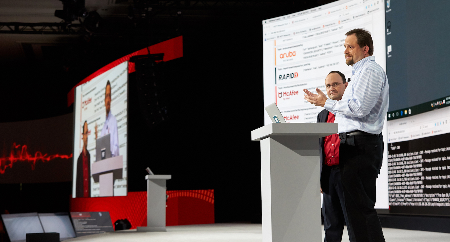
If you have a highly technical audience, they often have a high tolerance for nuanced, complex information if it’s packaged with clear descriptions of what’s inside. In this scenario, perhaps you want to consider a campaign of webinars or a suite of breakouts. What’s important with specialized content is that each content block be tagged with the topic, products, roles, etc., of who might be interested and why. This allows an attendee to preselect or calendar which sessions are likely to offer the most value.
Conversely, if you have a consumer audience, they are generally the opposite. For them, the value needs to reveal itself quickly, creating a positive feeling of affinity. Every minute counts and must be highly compelling. In this scenario, less time is better. It’s a good idea to make the content fast paced and of high production value, more like a television show. For these audiences, it often works to think “programmatically” like the design of a talk show or a news magazine program.
Best Practice: look at your content blocks and their associated audiences and assess what is a reasonable amount of time and content depth to meet their needs/expectations.
Thinking Programmatically
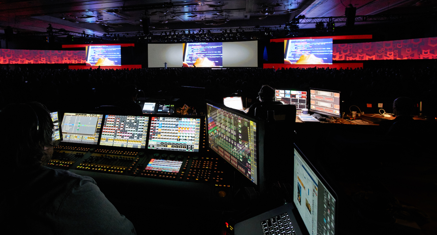
The art of thinking programmatically is in creating a great mix of graphics, video clips, interviewed experts, and field pieces in ways that keep the messaging “tight”. Every minute must be substantive and serve to advance the narrative. Part of sustaining audience attention is maintaining a fluid and dynamic progression of on-screen visuals, choreographed in a way that pulls the viewer forward through the story. An evolving set of visuals and motion engages the senses much more effectively than a visually static format.
This is why talk shows and news magazine shows are all organized by distinct segments, with varied formats and graphics packages. Your virtual event should be as well.
Best Practice: create a content map, delineate “segments” and then assign different formats and/or visual approaches to each; seeing it laid out will help you see the flow and help you be more certain of what content to keep and what to cut.
Determine the Content Sweet Spot
The content sweet spot is different for every audience, but as a general rule, it helps to have a “host” to move you between content. The host can be a professional, or your own engaging executive. It also helps to think “big and bold” for graphics.
We recommend that you do not begin the program design process with Powerpoint. Story should always be priority one, so begin with a solid story outline and then design the visuals needed to bring it to life. This method allows the visual environment to evolve organically and best-support the words and ideas of the storyteller.
From there, you’re exploring ways to use your visuals package in the most engaging way. Are presenters positioned in front of a large projection or LED surface…are they immersed in an environment via technology…are you editing in between your speaker and content with lots of animation and motion graphics? There are more design approaches to consider than ever before and you’re only limited by your imagination.
Latest and Greatest Creative Approaches
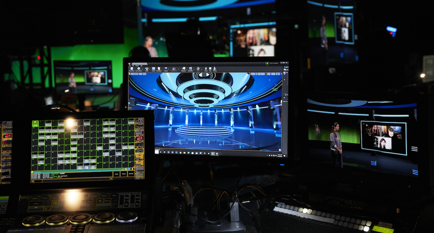
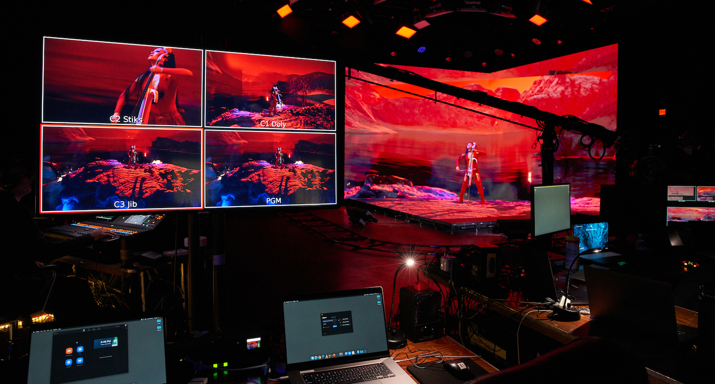
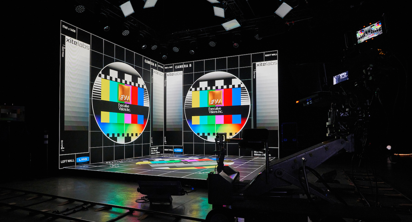
Some of the most exciting cinemagraphic advances are now available to corporate clients. No longer reserved just for elite filmmakers like Lucasfilm or Marvel, technology like “Extended Reality” or XR is now achievable in studios, ballrooms, or even corporate HQs. XR environments are designed using an open-faced, 3-sided LED cube in which a presenter appears to stand within a fully immersive environment. Our designers create these stunning environments using video-gaming engines like UNITY and Unreal Engine. The videogaming engine feeds a portion of that world onto the LED surfaces, giving the presenter a sense of graphic space as they speak. Within the broadcast feed itself, the imaginary world also “extends” beyond the LED-surfaces to the edge of the viewing screen. The audience enjoys a seamless virtual environment onscreen that is completely responsive to the speaker, reacting to and rendering in-sync with the presenter’s real-time movement. This is mind-blowing when you realize that you can dynamically transport your presenter and the story to any environment, real or imagined.
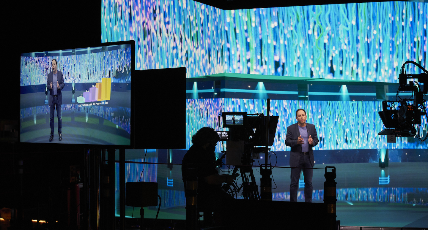
Another dynamic feature of this approach is the ability to layer Augmented Reality, or “AR”, graphics over top of the presenter or presentation space. You may have seen examples of this in high-quality television broadcast studios like during NFL games when graphics appear to layer around players on the field, or on the Weather Channel when a meteorologist is visualizing exactly how high the flood waters were relative to a person’s physical presence. This is great for data visualization techniques that appear in 3D space next to your presenter, or to show size and scale of concepts relative to the size of the presenter.
There are many creative ways to deploy both XR and AR to support the core principle of “visual variability” and we’d love to help you imagine how to apply them.
Best Practice: EVI has tremendous experience and expertise with these emerging technologies and would love to share case studies, demos and imagine how it could work for you. There’s a lot to consider…so, let’s get started!
Related Content
Virtual Event Production Part 1: Content Development
Virtual Event Production Part 2: Quality Technical Execution
More Stories
